Back
Similar todos
Load previous page…
Make input fields more contrasted with the background #contracting
See similar todos

No replies yet

Improvement: better dark color scheme #devsync
See similar todos

No replies yet

Increase contrast of hover color #devhub
See similar todos

No replies yet

Optimize the colors on all the screens
See similar todos

No replies yet

Darken gray text to improve Lighthouse accessibility score #domainwatchman
See similar todos

No replies yet

fix some UI elements having too many borders in high contrast mode #blip
See similar todos

No replies yet

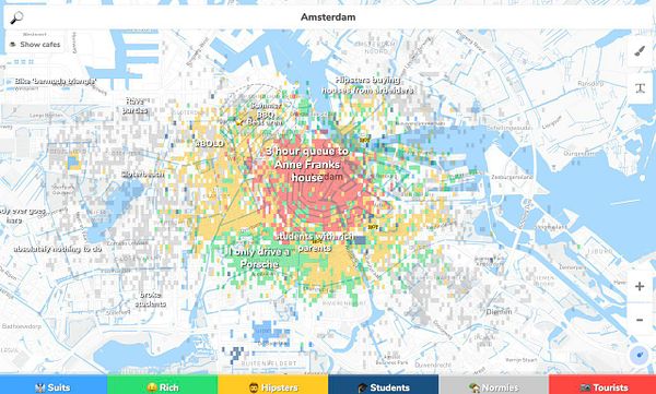
change map layout with less colors so the draw colors are clearer #hoodmaps
See similar todos

No replies yet

Minimize images #lucidbot
See similar todos

No replies yet

Slightly adjust the color palette #formkite
See similar todos

No replies yet

improve identifier check to switch theme between high contrast and normal mode #blip
See similar todos

No replies yet

#pintura fix contrast with input fields on top of fully zoomed image
See similar todos

No replies yet

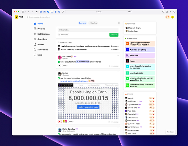
Switch back to gray background to get more focus on the content (with white background) #wip
See similar todos
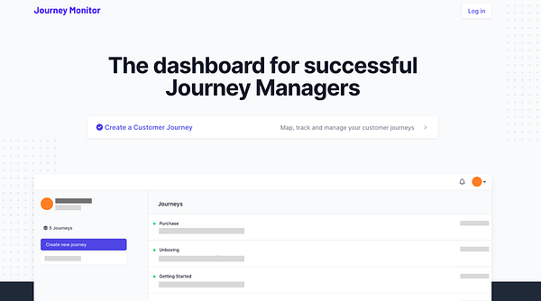
#orchetta improvement: Try dumbing down text on screenshot to grey blocks to improve design
See similar todos

No replies yet

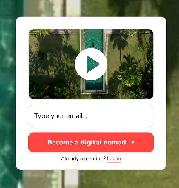
improve contrast CTA #nomads thx @cheepo2109
See similar todos

No replies yet

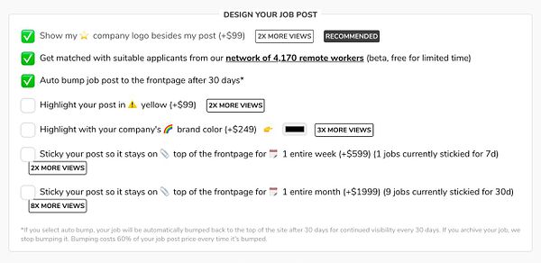
remove [ 2x more views ] red colors etc. and make it black for more professional design (via @shpigford) #remoteok
See similar todos

No replies yet

Cleanup the screens and adjust color hues #aint1
See similar todos

No replies yet

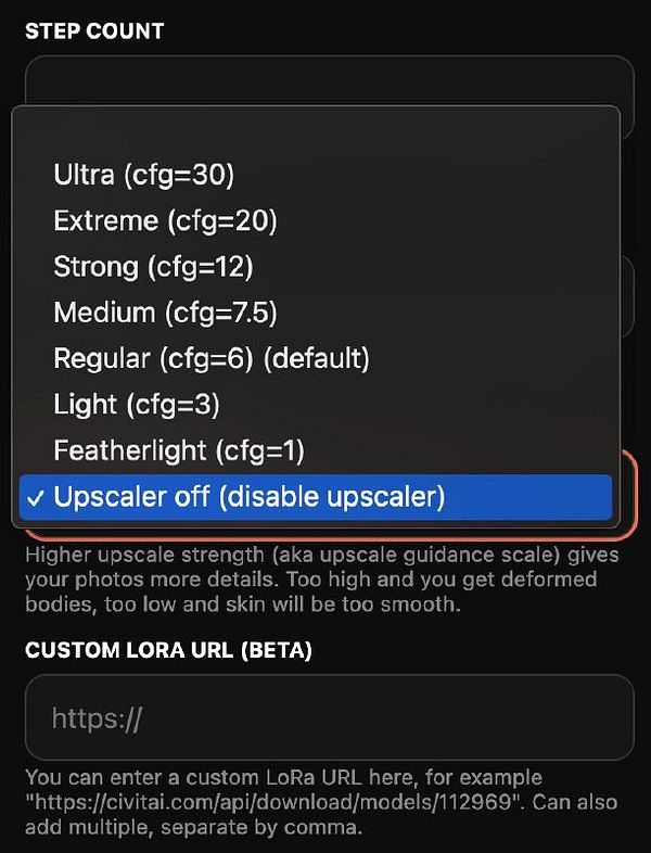
add disable upscaler mode for more artistic pics #photoai
See similar todos

No replies yet

Easy colors
See similar todos

No replies yet

make comparison palette smaller #prototypr
See similar todos

No replies yet