Back
Similar todos
write positioning blog post  #tweetsweeper
Feedback Button Design Fix  #emailverifier
move send buttons to the bottom  #support
remove the confusing button  #donthuntme
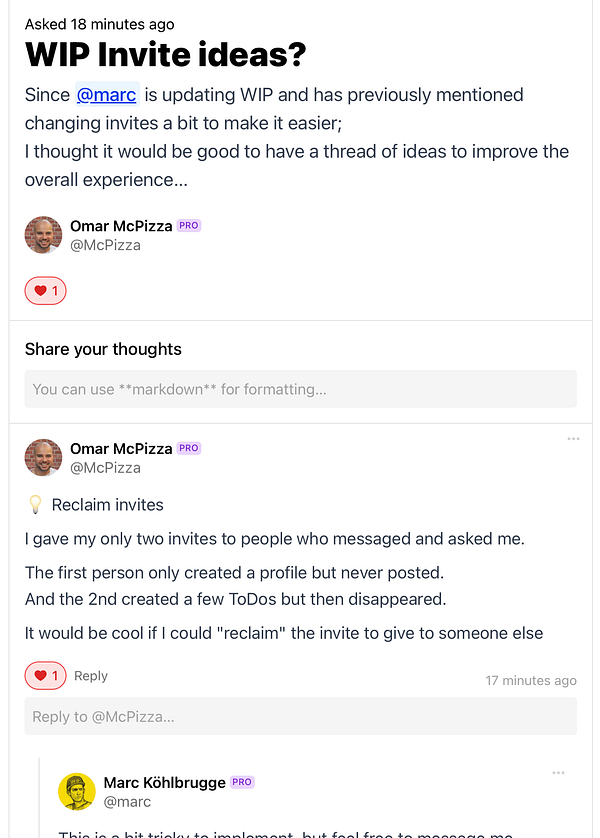
Move comment form to the top of the page (before, it was below all the existing comments) and add the user's @username to the reply textarea placeholder. Hopefully this makes it easier to understand what textarea is for responding to the post, and which is for replying to a specific comment  #wip
#wip
Add buttons to the right because it makes more sense  #sparkbase
Move Add Column button to the bottom  #devhub
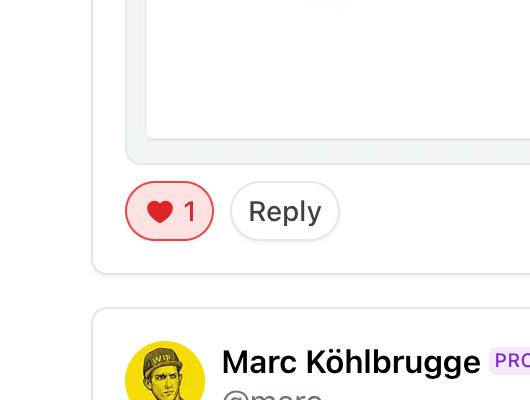
Make buttons a little nicer  #wip
#wip
fixed delete button alignment
Disable move column button if already at first/last position  #devhub
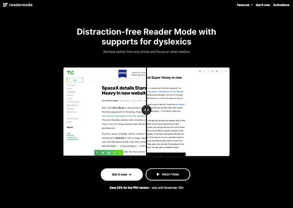
move comparison slider above the buttons for better visibility  #readermode
fix z-index post button  #remoteworkers cc @pretzelhands
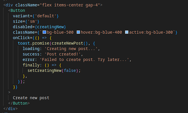
make button nice  #remoteworkers
don't wrap post buttons on mobile  #keyframes
