Back
Similar todos
Adjusted the colors on the home page  #pickant
Reducing contrast to make it easier on the eyes  #mintis
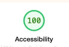
Update website colors to have better contrast so Lighthouse accessibility is 100  #checkyourlist
Overall design tweaks (changed some colors, changed separator size, fixed some alignments, input border color on focus, etc)  #devhub
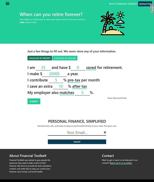
alter colors to give page more life  #financialtoolbelt
design tweeks on the color grading screen  #infinitestories 3.0
fix bg color bug  #csspro
small css tweaks for consistency of colours  #wi
#wi
test new bg color  #gamequitters (thx @deadcoder0904)
Changed the color theme of the code examples for  #screenshotone to a darker one.
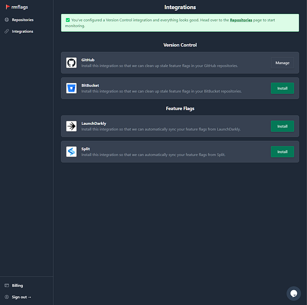
Improvement: better dark color scheme  #devsync
updated the font and color scheme to make it more readable #witsio
🎨 switched the website back to grayscale to stop getting lost on pointless design elements  #conf
#conf
🎨 Updated homepage to use new color scheme. (yay, tailwindcss)  #djangonews


