Back
Similar todos
Tweaks to benefits section - changed clock icon, edited copy #listskit
Switched 3D icons after getting feedback, tweaked shadows for pricing table #ketolistsingapore #listskit
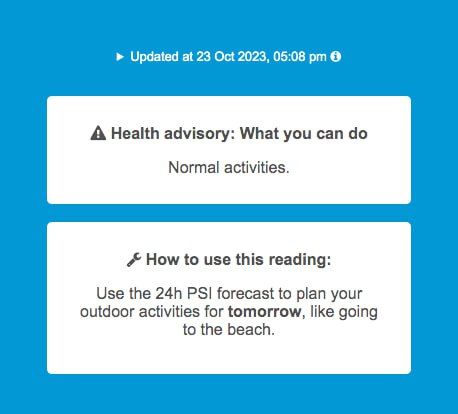
Tweaked layout/text for better info hierarchy - improved white space/margins of color banding box, moved Health Advisory box up for more prominence, updated PSI "How to" text with example #psisg #socialimpactpatronage
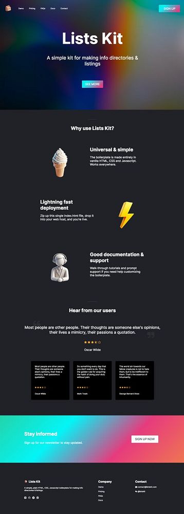
More dark mode tweaks, added 3D icons, removed unneeded sections... 60% there now #listskit
Updated changelog section in footer #listskit
Updated footer of docs page, added new lighthouse score screenshot and link #listskit
Added new component - centered CTA section with animated gradient CTA button #listskit
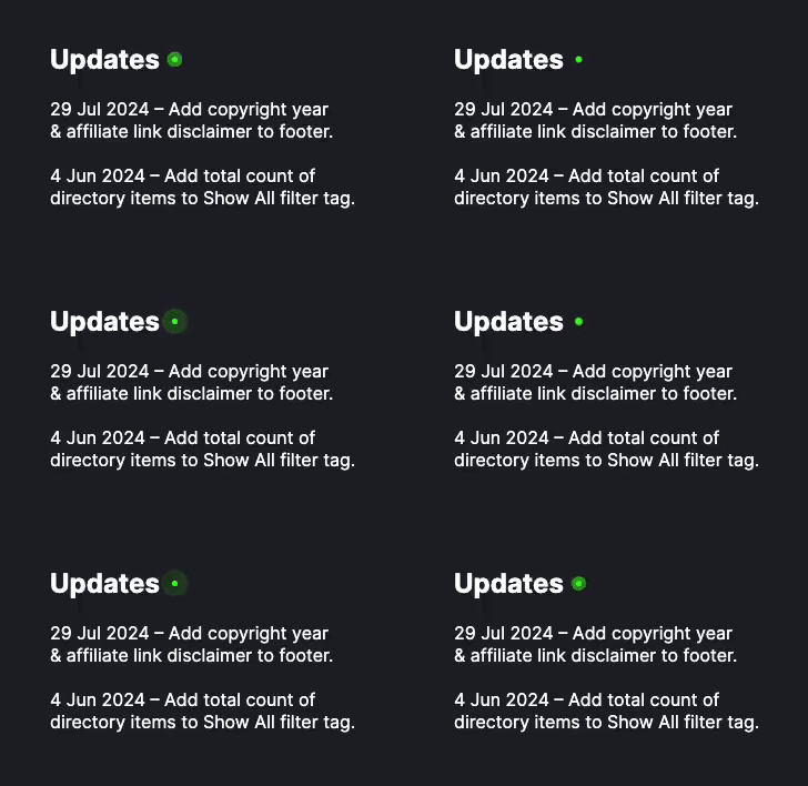
Changed app icon to green version, shifted dot indicators, some spacing fixes #psisg #socialimpactpatronage
Changed hero section design of home page - switched name to nav logo, added tagline to hero h1. + various media query fixes #listskit
Various style fixes - hide navbar btn, hide placeholder testimonial, changed hero btn and hero sub-text #listskit
Improved copy, added "curated by" in hero and about sections, fixed bug in horizontal scrolling for SaaS Starters - listskit.com/saasstarters #listskit
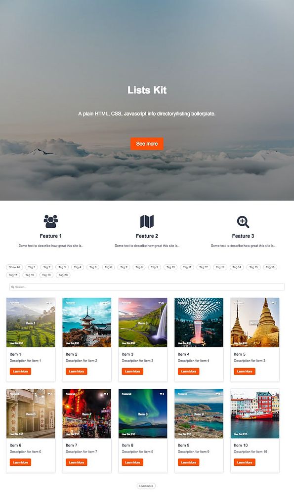
Added hero CTA btn, features section, more margins/spacing tweaks #listskit
Updated Updates section in footer #listskit
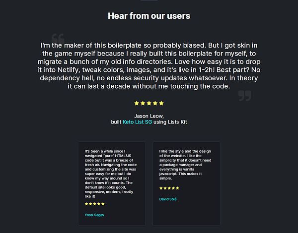
Added more testimonials (it's filling up now!), and updated footer "Updates" section #listskit
Added alt text to all <img> tags for better accessibility scores, on landing page and on boilerplates (both main and beta) #listskit
Added CTA section, rolled my own loading spinner, fixes to spacing for resp #listskit
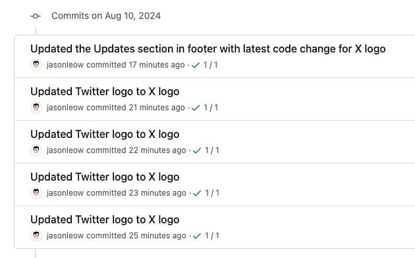
Updated Twitter logo to X logo on all pages of boilerplate demo, boilerplate download, lighthouse demo. Updated Updates section in footer of main landing page to reflect the code update too. #listskit
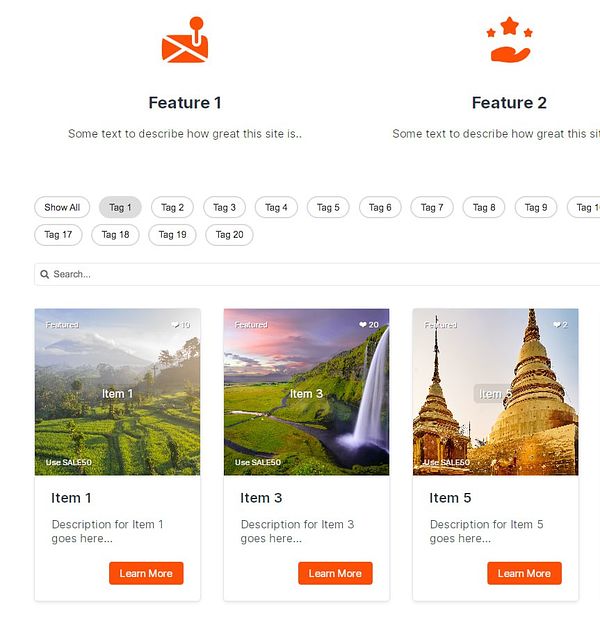
Curated filter tags to the popular ones, changed it to horizontal scrolling, and dumped all the filter tags with categories into a modal - I think this works well! #listskit
Based on user feedback, added more inline comments to guide users, at sticky footer tag and directoryData array - in /demo & blank boilerplate. Updated readme file on beta repo with more tips. #listskit
Added script to toggle background-color of filter btn, added float right to card btn (so it looks less like Bootstrap), added feature icons as img tags instead #listskit
