Back
Similar todos
Tweaked the app icon, logo and favicon for the LAST TIME - gave the icon a dark green cos the white just wasn't salient at the size of the app icon on the phone screen #psisg #socialimpactpatronage
Tweaked app icon yet again - made it bigger and more centered for more salience on phone screen #psisg #socialimpactpatronage
Selected 2 app icons generated by DALL-E 3 and cleaned up the design. Now faced with a choice... 🤔 #psisg #socialimpactpatronage
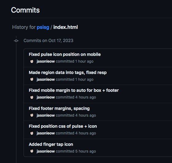
Various fixes - footer and box margins, mobile responsiveness, proper positioning of finger icons #psisg #socialimpactpatronage
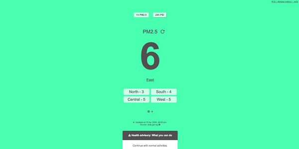
Prettified the top toggle bar to more clean buttons, and slight box-shadow to indicate which one is active ('pressed down') #psisg #socialimpactpatronage
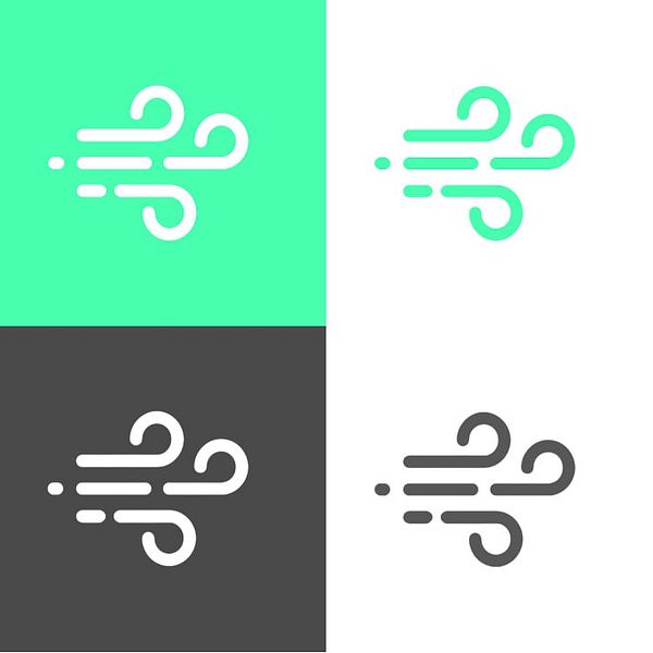
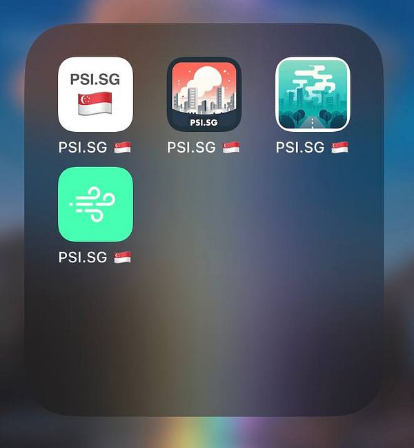
4th iteration of PSI.SG logo and app icon. I think I'm done with designing this, not mission critical work! #psisg #socialimpactpatronage
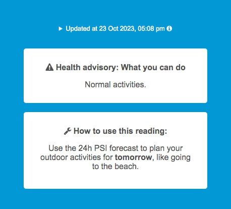
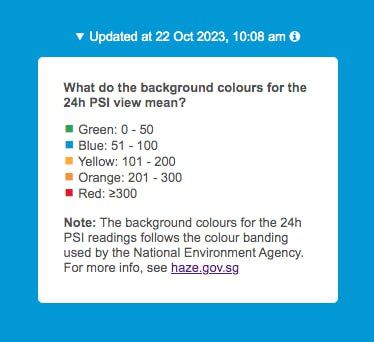
Tweaked layout/text for better info hierarchy - improved white space/margins of color banding box, moved Health Advisory box up for more prominence, updated PSI "How to" text with example #psisg #socialimpactpatronage
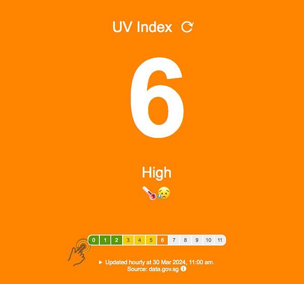
Added finger gesture icon with pulsing CSS animation, and made the regional readings into buttons like the buttons above, in order to signal interactivity #psisg #socialimpactpatronage
4 generations of PSI.SG logo/app icon #psisg #socialimpactpatronage
Changed favicon to something waaay simpler cos no one can see the details when it's just 32px #psisg #socialimpactpatronage
App icon and logo brainstorming with DALL-E 3.. super impressed! It's an obvious step up from the previous #psisg #socialimpactpatronage
Tweaked favicon to just show "PSI" instead of "PSI SG" so that it's more salient #psisg #socialimpactpatronage
Added Font Awesome icons to replace unicode symbols #psisg #socialimpactpatronage
Added color banding dropdown info based on feedback #psisg #socialimpactpatronage
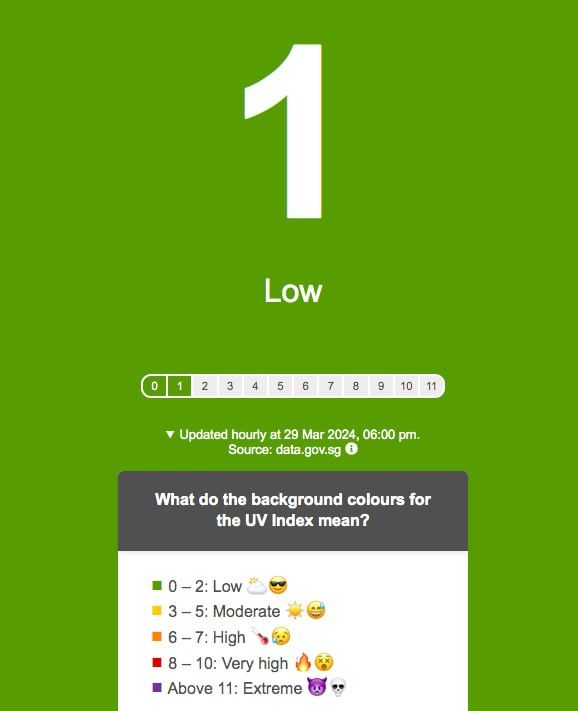
Added emoji to main metric for better UX, added pulse icon to hint at clickability. Fixed bugs from feedback #uvindexsg #socialimpactpatronage
Added emoji icons, progress bar to make it clearer what the number and label means #uvindexsg #socialimpactpatronage
Added pulsing animation near regional data to indicate to users they can click/tap on it (cos it's not underlined like a link) #psisg #socialimpactpatronage
Minor edits to meta tags, and updated tagline and og image to "at a glance" - psi.sg #psisg #socialimpactpatronage
Fixed background color bug in psi.sg #psisg #socialimpactpatronage
Fixed typos, text alignment in color banding box #psisg #socialimpactpatronage


