Back
Similar todos
Load previous page…
Remove green background change when checklist is complete  #checkyourlist
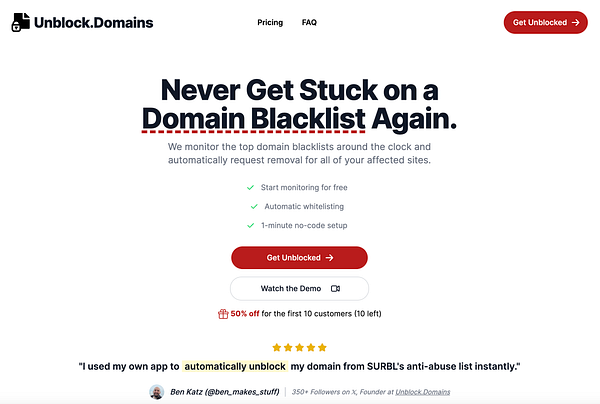
Updated the color scheme to red because I think it has way more emotion involved than that emerald green color I was using before  #unblockdomains
Make "in review" badge grey instead of orange since orange looks like a warning  #stealthproductlaunch
use better color palette  #kubiko
make idea name black instead of the accent color so it's easier to read #rikko
changed the color #ygl
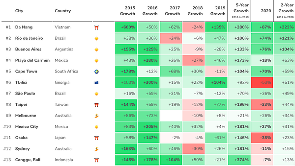
rewrite the code for the colors so the table looks better on nomadlist.com/trends  #nomads to prepare for tweet about it
Improve environment variable name to make it clearer what is being accessed  #newsletty


