Back
Similar todos
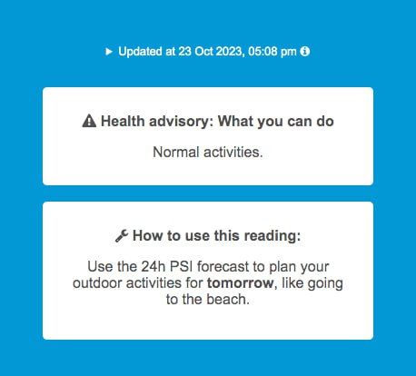
Tweaked layout/text for better info hierarchy - improved white space/margins of color banding box, moved Health Advisory box up for more prominence, updated PSI "How to" text with example #psisg #socialimpactpatronage
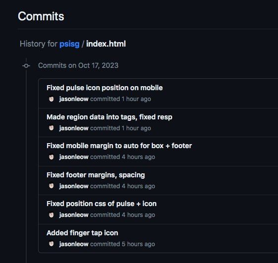
Various fixes - footer and box margins, mobile responsiveness, proper positioning of finger icons #psisg #socialimpactpatronage
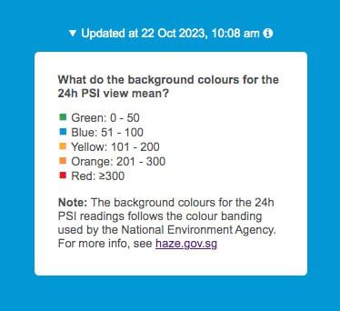
Fixed typos, text alignment in color banding box #psisg #socialimpactpatronage
Added color banding dropdown info based on feedback #psisg #socialimpactpatronage
Prettified the top toggle bar to more clean buttons, and slight box-shadow to indicate which one is active ('pressed down') #psisg #socialimpactpatronage
Added pulsing animation near regional data to indicate to users they can click/tap on it (cos it's not underlined like a link) #psisg #socialimpactpatronage
Fixed weird off spacing of boxes by adding margin: auto - thanks Guilherme! Also fixed wrong og meta tag description #psisg #socialimpactpatronage
Added finger gesture icon with pulsing CSS animation, and made the regional readings into buttons like the buttons above, in order to signal interactivity #psisg #socialimpactpatronage
Added Font Awesome icons to replace unicode symbols #psisg #socialimpactpatronage
Added browser-specific prefixes for CSS animation, and other style fixes #psisg #socialimpactpatronage
Changed app icon to green version, shifted dot indicators, some spacing fixes #psisg #socialimpactpatronage
Minor edits to meta tags, and updated tagline and og image to "at a glance" - psi.sg #psisg #socialimpactpatronage
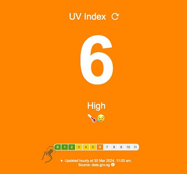
Added emoji to main metric for better UX, added pulse icon to hint at clickability. Fixed bugs from feedback #uvindexsg #socialimpactpatronage
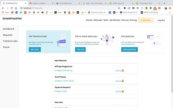
added undraw illustrations to profile header cards  #growthhacklist
Tweaked favicon to just show "PSI" instead of "PSI SG" so that it's more salient #psisg #socialimpactpatronage
added x icon to card selector  #prototypecards
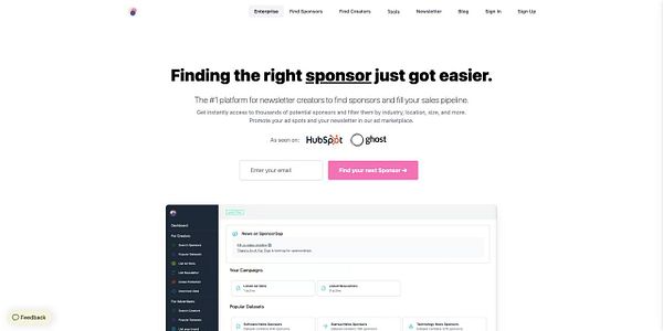
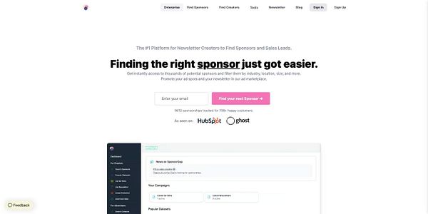
changed headline header of sponsorgp a bit to improve conversion  #sponsorgap
Tweaked app icon yet again - made it bigger and more centered for more salience on phone screen #psisg #socialimpactpatronage
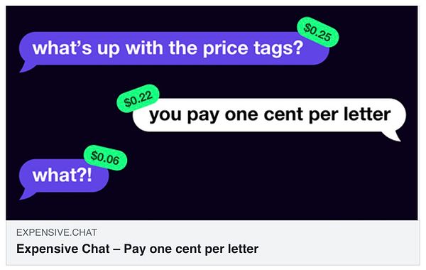
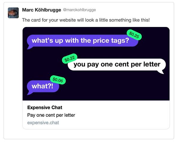
add social media cards  #expensivechat
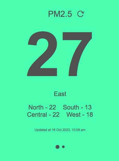
Added carousel indicator dots to show you can swipe to next reading (for upcoming swipe gesture on mobile) and invisible touch arrow to toggle between PSI & PM2.5 #psisg #socialimpactpatronage
