hey, so this is roast, I didn't invent the rules. Overall it's not a bad landing, clear what it does and what's the value.
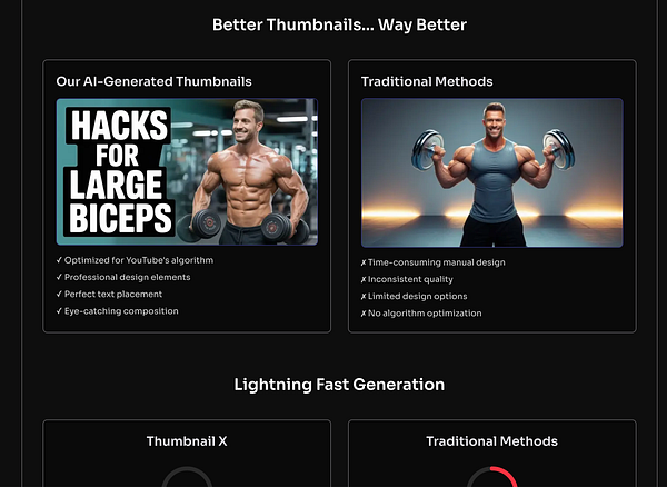
Part on the screenshot looks like a straw man comparison. On the right it says manual preview but it's clearly a different neural network-made preview. Also on the "good" example head almost touches the edge which is maybe eye-catching but not in a way that wants me to use it.
Next slide says that if you make preview manually you save hours of work per each, and shows infinity symbol. I don't believe it's true, especially the infinity part.
Everything is put on a card. What doesn't help is the body is wrapper into another container, so it looks like two levels of hierarchy without a reason. Sometimes you add third level with a different background. That's probably things you actually wanted to make cards.
All headings have the same level.
Only one of the verified reviews goes to trustpilot. What verifies the others?
I don't believe trial plan with smaller models will make a good impression of the product but maybe I'm wrong.
Cheers and good luck with your app, makes total sense to not make previews manually.
It's beautiful, and the copy is great. But the page doesn't answer questions I really have. Google translate has a speech mode, it's free and doesn't restrict time, why should I use your app instead?
Another thing, the only demo video shows how you select a language but it's probably the least interesting part. What comes next? Again, this might answer how different it is from google translate.
design-wise, it looks like you put everything on cards, sometimes there are 3 levels of them. You probably don't need most/all but one of them. The one I'd keep is the bottom one (pic 3)
Another thing is some layers are wider than others without an obvious reason, and most hover animations don't make sense to me either. Icons don't particularly mean anything to me.
Text centering doesn't make sense in most places. Spacing is arbitrary.


Thanks for checking Sergei. Now I can't unsee the things you mentioned (which is a good thing!). In the next couple of days I'll focus on the design aspect.
Homepage went through multiple revisions when new features were added.
Considering all these, I think better to use a proper template like Tailwind UI or get help from a designer.
Other than these, is it clear what the product is about? I think we need pictures or videos too based on comments from others.
Thanks again for taking the time to go through it and giving me suggestions :)
one thing that catches eye is that you're trying to upsell even before people tried the thing. I bet that won't convert much.
Other but somewhat related nitpick would be that you put all the instruction into the person's face at once before they had a chance to use the app. I'd let them do it for a couple of days, track what is not used and maybe show a tip after they did their thing like "3 days streak already, great, btw here is a link for your friends to join so it's easier to keep it for you both"
I think you're right on all counts. The checkin be reduced to two steps. Then you should asked if you want to invite friends or explore the app.
No clue when to paywall though. I've seen a lot of people have success with length onboarding then hard paywalls. I think I'll try no paywalls, only paywalls shown when they try to use a paid feature.