




- The page has no personality. It seems like a random, poorly designed theme with an irrelevant stock photo. It doesn't inspire confidence as well. I'd be happy to provide more comments on why I think the theme is poorly designed if you're interested. (mostly typography)
- There are many prospecting services. Your page doesn't tell me why yours is better or even how it's different
- It lacks any credibility. You mention the "team" (you), which is a good start, but you don't provide "proof" of why we should trust you.
- Language like "CASH IN" is a big turn off for me. Makes it sound like some sort of pyramid scheme.
I'm not your target market (I'm not interested in using a prospecting tool), so I'd recommend reaching out to people you think are potential customer. Ask them to be critical. Explain your product through conversational language. Take note of any questions/criticism they have. Come up with solid answers. Refine your explanation over time. Up until they are truly excited to give your product a try. Then convert this conversational explanation to a landing page.
Ouch, that hurts a bit ;) but it helps even more - thanks a lot Marc!
For these roasts I tend to focus on the negative as I feel that's the most helpful. Take it with a grain of salt though. I'm peculiar when it comes to sales-oriented products.
Do you know Clearbit? I think it's a great example of a sales-oriented product suite with great marketing and landing pages.
Nope, didn't find Clearbit yet, thank you! I know Salesforce, found Salesmachine and basically think these people might be happy for my help :)
I don't know if you waste your time explaining details about the theme, because (as you quickly figured out) I just picked the first one that looked decent for the use case. But sure - yes I'm interested!
"proof" - like customer reviews, recommendations?
Yes "CASH IN" - you're not the first to criticize this.. I'm trying to adopt sales language.. probably too much
reach out to Sales people - is out and waiting, I hope to receive feedback tomorrow.
"proof" - like customer reviews, recommendations?
Credentials (e.g. relevant work experience), social proof (customer reviews), etc.
Ya; Clearbit is great, but it's targeting salesops or sales leaders to get implemented; looks like Jonas is targeting IC sales folk; so, something like mixmax might be a closer hit marketing wise (though, they do both - maybe calendly.com)
I'm not sure why the language of the articles would matter. Doesn't show results from all languages by default? If not, it's an option in Advanced Search.
If you want something more full featured you can take a look at Mention. It lets you monitor your app's name across different channels like websites, social media (tweets, etc) and more.
As far as I know there's no official channel for this.
I've had some success in the past tracking down the owner by checking previous messages, followers, and who they interacted with. Googling names, checking Facebook, etc. But it depends on the account and level of activity on whether that's a feasible strategy.
If you know the right people at Twitter, they could obviously help as well but I'm assuming you don't have such contacts. Me neither, for that matter.
Some people might suggest registering a trademark and reporting the account as infringing on it. I don't know if anyone ever made that work though. As the infringement only counts when there's reasonable doubt about whether represent your brand which is a hard case to make for an inactive account.
It doesn't hurt contacting support, but I don't know of anyone succeeding that way either.
My advice: try to do some research on their followers/activity and if that's fruitless move on and try again once your company is more established. By that time it might be more likely Twitter will care.
I don't know of any out-of-the-box solutions, so I recommend starting out manually and then automating if there's enough demand to warrant the investment.
If you hook up your domain to something like Mailgun it's relatively straightforward to set up aliases.
As for payment and collecting customer information, it depends on whether you want to charge a one-time or recurring fee. In case of a one-time fee I'd look into setting up a Typeform with Stripe payment. For recurring payments, I'd look into Memberful. I don't know if they allow you to collect additional information (such as the alias the user wants), but you can always send them an email or Typeform link.
I'd start off doing this manually. If there's enough demand, look into automating it with Zapier or coding it up yourself.
Thanks Marc! Yeah, as with most things I will make it manual first to see if there is a demand. Will try out mailgun and I already have a typeform account with Stripe 👍
- The lines are quite long. I think ~10 words per line is ideal. So increase font size or make the paragraphs more narrow.
- The typeface is interesting and adds a lot of personality to the page. However, it's hard to scan and there's quite a lot of text.
- I really dislike the experience of not seeing what I'm writing. I'd prefer if at least I could see the current word. What I'd like even better is for the rest of the text to just be dimmed rather than complete invisible (similar to iA Writer)
- Overall though I'm just not convinced of the product's concept, so I wouldn't even give it a fair chance.
- The trial signup is rather intimidating. So many fields to fill out. Email should be enough.
Thanks for the constructive feedback.
Your reaction to not seeing what you are writing is fairly common - people feel uncomfortable . For others, it is the exact opposite - they feel joy in just writing.
Points on fonts spacing etc are well made, and I will make these changes.
Agreed the trial signup is rather intimidating. Going to fix this.
I haven't used Paddle myself, but I like about Stripe is how well popular it is. This means it has a large eco-system of third-party products (analytics, dunning, etc) and code tutorials. This one is quite good: courses.gorails.com/payments-…
This seems like the type of idea you just need to try and grow incrementally. It all boils down to finding enough relevant and interested people in your vicinity.
I'd organize a meetup. See if you can find enough people to attend. Organize another a month later. If more people attend (i.e. people come back and bring friends), you're onto something. If fewer people show up, try something else.
About font-size, they are all 16px+. Is your browser rendering them differently?
You're right. Most of it is 16px+ I now see. I was using a Cinema Display before which I guess renders everything a bit smaller than my laptop. I think slightly larger than 16px would be better.
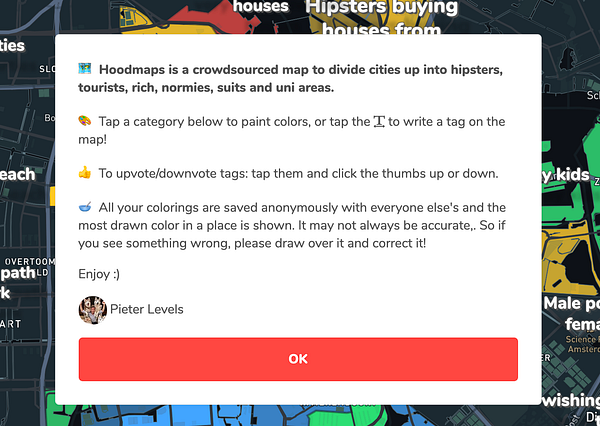
- The welcome text is quite long. I think you'll get more people to read it, if you shorten it to a sentence or three. Maybe make it more visually appealing as well with better typography, icons, and just overall make it more scannable.
- I still think the tags (texts) should be more readable. Thicker outline should do it. Maybe a different font would help too, although I like the playfulness of the current one.
- When in 'raw data' mode, don't hide it when dragging the map around
- On iOS there's a transparent 1px hairline at the bottom of the 6 colored tabs that shows the underlying map. It's barely visible, but if you move around the map you'll some white pixels moving (tags)
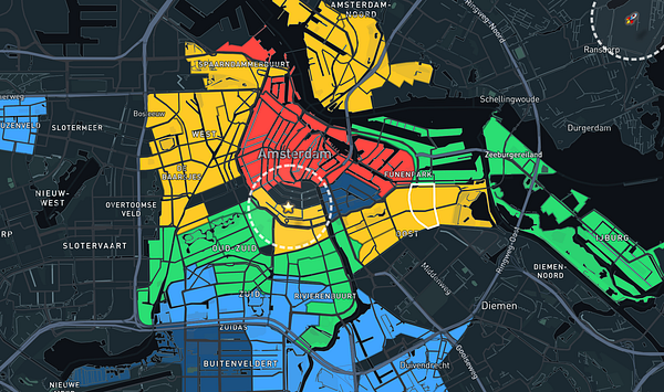
- 2.0 looks kinda dark versus 1.0 – I liked the bright colors better. I do like you got more contrast now, but it doesn't feel as fun as before.
The welcome text is quite long. I think you'll get more people to read it, if you shorten it to a sentence or three. Maybe make it more visually appealing as well with better typography, icons, and just overall make it more scannable.
Thanks, made welcome text shorter and added icons now.
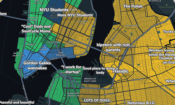
2.0 looks kinda dark versus 1.0 – I liked the bright colors better. I do like you got more contrast now, but it doesn't feel as fun as before.
Thanks, not sure how to fix. Maybe I can pump the colors a bit. They're diluted now because they show the confidence of the category value (numberOfSamplesSayingThisAreaIsThatColor/allSamplesInThisArea)
For these roasts I tend to focus on the negative as I feel that's the most helpful. Take it with a grain of salt though. I'm peculiar when it comes to sales-oriented products.
Do you know Clearbit? I think it's a great example of a sales-oriented product suite with great marketing and landing pages.
Nope, didn't find Clearbit yet, thank you! I know Salesforce, found Salesmachine and basically think these people might be happy for my help :)
I don't know if you waste your time explaining details about the theme, because (as you quickly figured out) I just picked the first one that looked decent for the use case. But sure - yes I'm interested!
"proof" - like customer reviews, recommendations?
Yes "CASH IN" - you're not the first to criticize this.. I'm trying to adopt sales language.. probably too much
reach out to Sales people - is out and waiting, I hope to receive feedback tomorrow.
Credentials (e.g. relevant work experience), social proof (customer reviews), etc.
This x 100; it build trust, especially if they know the company or have heard of it.
Ya; Clearbit is great, but it's targeting salesops or sales leaders to get implemented; looks like Jonas is targeting IC sales folk; so, something like mixmax might be a closer hit marketing wise (though, they do both - maybe calendly.com)