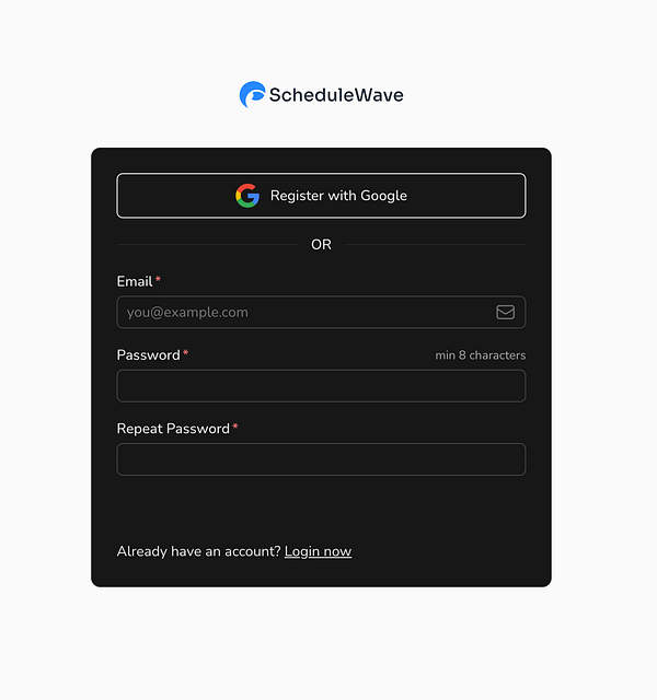
Hey, thanks for your feedback. That's weird I see it like this (see image). The login page has a darker gray color, do you mean that? Should it be white?
Thanks!
^ Looks better in your screenshot. You likely have a tailwind "dark:" prefix that is fucking with how it's being displayed on certain devices that have dark mode enabled, which is why I never use the dark CSS utilities that tailwind provides
The login UI looks like this for me and does not blend in with the rest of the theme, it should be light themed as well (see below)
Yes instagram and fb are available as well. Only waiting to be approved by fb review team :)
Would love to test it then. Ultimately I'm looking for all platforms but first I would like to focus on Instagram as I have an audience there.
Hi Nick, thanks for your reply. That would be really cool. If you register on the site I will give you a free account! Currently, there is no difference between Feedhive and ScheduleWave, however, maybe I will niche down on some things.
"When a market is crowded and saturated, it means that many people want to buy something, and there are lots of options available, which makes suppliers compete with each other."
I really like these 2:
- Revenue / MRR for each project
- Weekly/monthly recap of their progress
What would you like to see in the recap? What format would you prefer?


Thanks, that's great feedback! Will implement that :)