Back
Similar todos
Tweaked favicon to just show "PSI" instead of "PSI SG" so that it's more salient #psisg #socialimpactpatronage
Added Font Awesome icons to replace unicode symbols #psisg #socialimpactpatronage
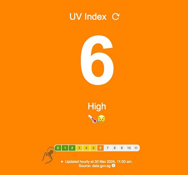
Added finger gesture icon with pulsing CSS animation, and made the regional readings into buttons like the buttons above, in order to signal interactivity #psisg #socialimpactpatronage
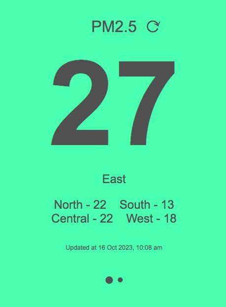
Changed app icon to green version, shifted dot indicators, some spacing fixes #psisg #socialimpactpatronage
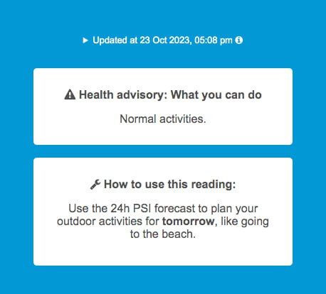
Tweaked layout/text for better info hierarchy - improved white space/margins of color banding box, moved Health Advisory box up for more prominence, updated PSI "How to" text with example #psisg #socialimpactpatronage
Prettified the top toggle bar to more clean buttons, and slight box-shadow to indicate which one is active ('pressed down') #psisg #socialimpactpatronage
Tried using svgs from svgrepo.com to eliminate the need for fontawesome, but ended up needing more work to tweak the colors of the svgs dynamically due to the reading level.. much work! Gotta think if it's worth it #psisg #socialimpactpatronage
change icon from ASCII to Fontawesome on overlapping warning  #cssscan
Added carousel indicator dots to show you can swipe to next reading (for upcoming swipe gesture on mobile) and invisible touch arrow to toggle between PSI & PM2.5 #psisg #socialimpactpatronage
Added pulsing animation near regional data to indicate to users they can click/tap on it (cos it's not underlined like a link) #psisg #socialimpactpatronage
Tweaked app icon yet again - made it bigger and more centered for more salience on phone screen #psisg #socialimpactpatronage
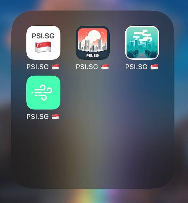
4 generations of PSI.SG logo/app icon #psisg #socialimpactpatronage
Added emoji to main metric for better UX, added pulse icon to hint at clickability. Fixed bugs from feedback #uvindexsg #socialimpactpatronage
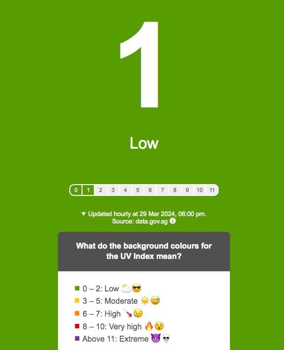
Added emoji icons, progress bar to make it clearer what the number and label means #uvindexsg #socialimpactpatronage
Tweaked the app icon, logo and favicon for the LAST TIME - gave the icon a dark green cos the white just wasn't salient at the size of the app icon on the phone screen #psisg #socialimpactpatronage
switch old fontawesome icons to SVG  #japandev
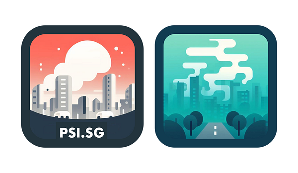
Selected 2 app icons generated by DALL-E 3 and cleaned up the design. Now faced with a choice... 🤔 #psisg #socialimpactpatronage
change wording + add icon make big difference  #prototypr
Switch to Font Awesome 5
Change the font-awesome pictos  #pickant


