Back
Inflation Chart
Inflation Chart
#inflationchart
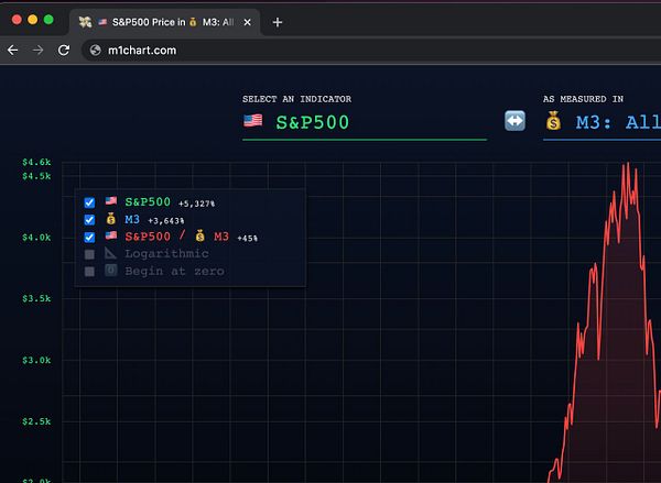
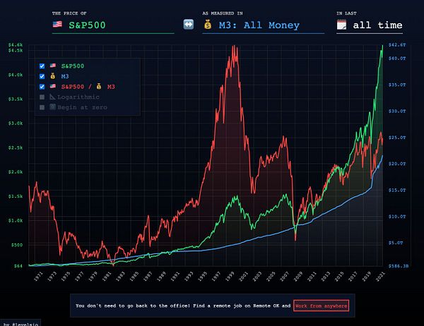
Show stock market growth adjusted for US dollar money supply
Launched February 12, 2021
Load previous page…

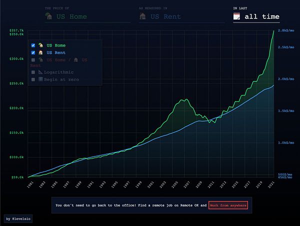
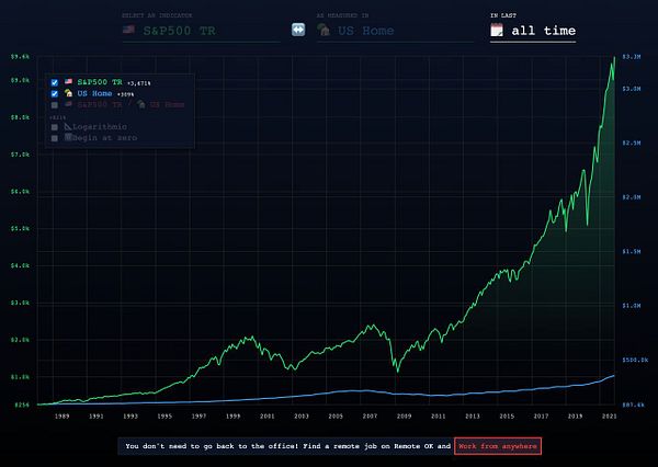
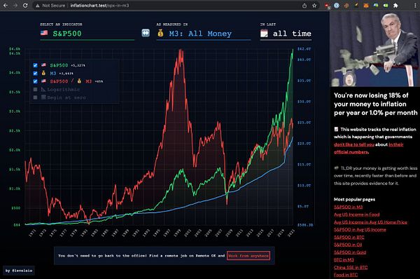
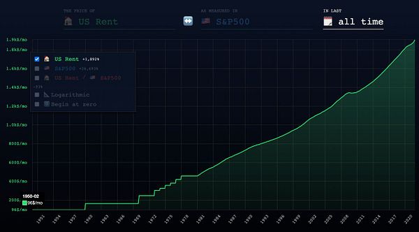
add S&P500 Total Return (SPXTR) which is a metric index that shows S&P500 with reinvested dividends over time to better compare the return of investing in the stock market with other metrics like investing in a house, this proves that buying a house has 309% return over last 30 years, S&P500 has 3,671% return, as most mortgages are 5x leveraged, this means even WITH a mortgage @ 5x your return would be 1,545% vs S&P500 return of 3,671%, so even WITH a mortgage you’d be making half vs investing the stock market for 30 years  #inflationchart

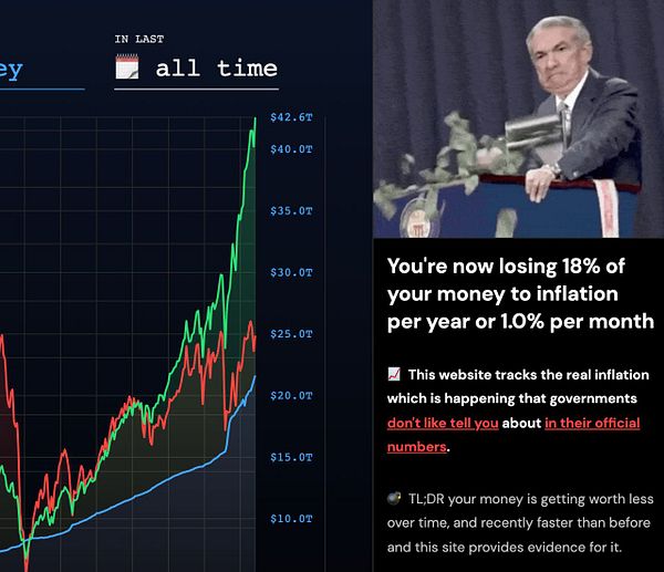
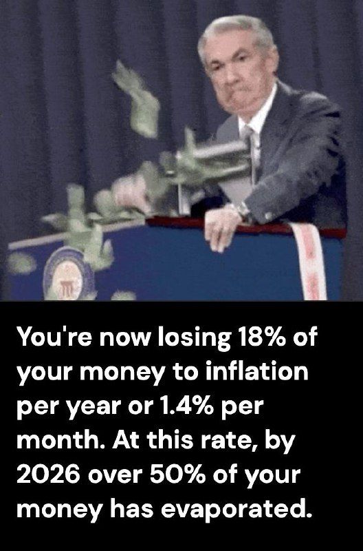
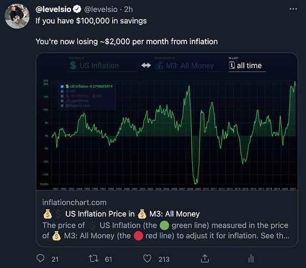
tweet that you losing $2k/mo if you have $100k in savings #inflationchart twitter.com/levelsio/status/1…
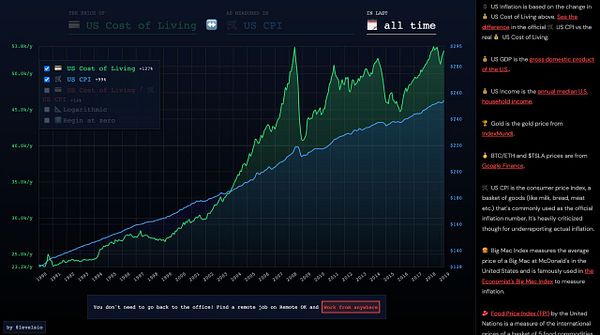
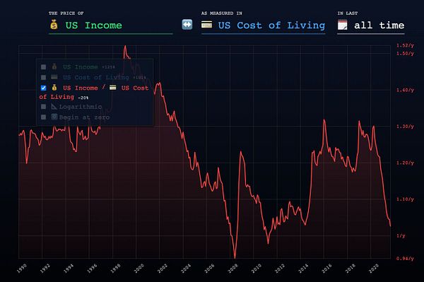
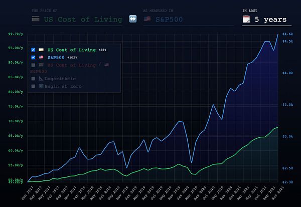
add % growth to A / B divider to show REAL cost of living decrease, e.g. -20% in US compared to 1990 #inflationchart
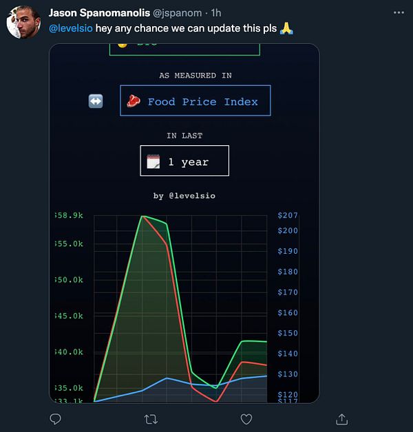
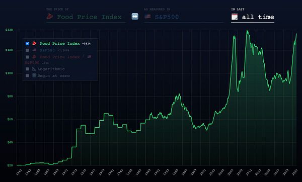
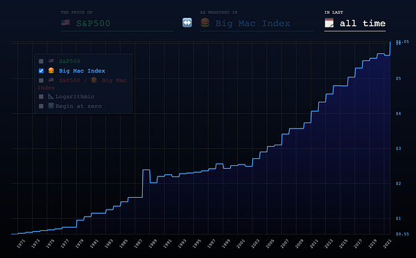
update 🍔Big Mac price because it went up from $5.66 to $6.05 (+6%) in October due to inflation #inflationchart
fix empty #inflationchart og:image because it was default redirect to /spx-in-m3 but via JS so Twitter Bot didn’t catch it