Open-source WIP so we can make pull-requests? :)
I did consider this for a long time. But people who've done this often say it's a lot of work to manage contributions. So I'm not so sure anymore it's worth the trade-off.
There's also a decent risk of people straight out copying our hard work for their own personal gain. Even if the license would not allow it. This is already happening to some extent (people straight up copy our design, copy, etc to make a competing product).
Add a way of "clapping" a task and not only the comments
I've been on the fence for this one as I think it's a two-edged sword.
One the one hand it's a useful way showing someone you saw their todos and appreciate it. Not everything warrants a written comment.
But on the other hand, it's so easy those claps can quickly lose their meaning. And only a lack of claps remains meaningful, but in a bad way.
It wouldn't be too hard to run an experiment for a few weeks and see what happens. It's a relatively easy feature to build. (We actually experimented with this same idea, but only available through the chat. So the foundation is already built).
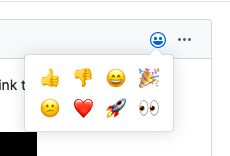
What if you add a small set of icons to show "reactions", like the one's at FB?
Yeah those those are fun, but also have their downsides. Basecamp wrote a great article about it: Introducing Boosts: an all-new way to show your support in Basecamp
Their approach is quite interesting too. I prototyped it for WIP, but eventually settled on regular comments.
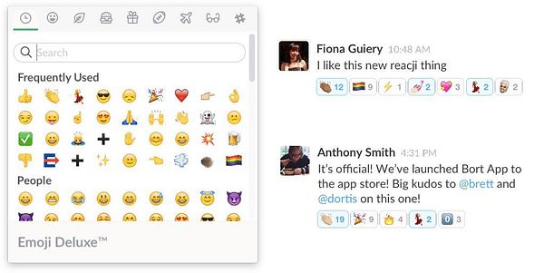
But it's definitely something we can explore. We could have one type of reaction (👏), multiple types (e.g. 👏 😍 😢 🎉), or allow any emoji like Slack has:
Shorten displayed URLs in the generated HTML, I like the way Twitter is doing it
I never noticed this to be honest. But you're right. If there's a long URL in a tweet, it only shows the first X number of characters.
I haven't really found long URLs to be an issue on WIP, but I will keep that idea in mind. Wouldn't be too hard to implement.
Another example (not from me) -> wip.chat/@gijsheerkens/todos/…
To keep the interface light but allow more customization, maybe we can try having something like this that affects CSS: www.conventionalcommits.org/e…
Basically, if you type [bugfix] the normal human-readable text, WIP knows that it's a bugfix and can update the CSS, it can also be cool to have some stats about the task kinds
I really like that! I've been toying with the idea of adding support for regular hashtags. I think it could open up a bunch of possibilities. For example grouping all #marketing tasks together. Or indeed #bugfix'es etc.
The reason I haven't implemented it just yet, is because it might get confusing having both regular hashtags and product hashtags.
I agree that hashtags would be better, maybe you can just reserve some keywords that can't be used as project hashtags?
I consider that WIP can be used as a kind of changelog, in long-running changelogs, you often have an introduction section that focuses on highlights and a way of seeing more if you care
Here is my inspiration: blog.golang.org/go1.14
Some people use the "Product Updates" feature for this, which lets you write rich text posts about your product. It requires you to do more writing, but the upside is that you can nicely summarise a bunch of different changes in one cohesive story.
That feature needs a lot of work though. It's not very discoverable to begin with, and when you publish a post it doesn't get much attention on the site.
What do you think of this solution? Being able to write a short post, optionally linking to certain todos.
Yes, it can be the solution, and I like the idea to have more work to do when you want to highlight something 👍
I think that:
1. it should be displayed on the timeline (don't know if it's the case today)
2. it should probably "count" as a done task for the author
It currently isn't displayed on the timeline. It totally should though!
Right now it doesn't count as a done todo either. I guess we could make it count for the streak, as writing a status update is indeed work. And having to create a todo "Wrote a product update" just after you wrote it on WIP seems like unnecessary work.
I start to know individuals and their habits, to I pretty like the current view, but if you can keep the two views, yes, it can make sense to switch to the ungrouped view by default 👍
Or to keep WIP simple, maybe you can use the per-event view by default, and the grouped-by-user one only for people you follow?wip
So the nice thing about grouped-by-user is that you get the full context of what someone is working on today. One todo by itself might not always be meaningful, but by seeing the other things that person worked on today you get a good sense of what they are doing.
On the other hand, the downside is that every time someone posts a new todo it bumps up their whole list of that day. So as a viewer you start seeing the same content and you're not sure if there's anything you haven't seen it yet further down the page.
Perhaps there's an alternative solution possible. For example only showing the new todos (grouped per user), with the todos you've already seen hidden by a "See 4 more todos…" button. Although that would require us to start tracking which todos you've already seen. Or least a timestamp of when you last viewed the homepage. (anything created after that would be considered unseen).
Spotlight / highlighted tasks
I consider that WIP can be used as a kind of changelog, in long-running changelogs, you often have an introduction section that focuses on highlights and a way of seeing more if you care
Here is my inspiration: blog.golang.org/go1.14
Some people use the "Product Updates" feature for this, which lets you write rich text posts about your product. It requires you to do more writing, but the upside is that you can nicely summarise a bunch of different changes in one cohesive story.
That feature needs a lot of work though. It's not very discoverable to begin with, and when you publish a post it doesn't get much attention on the site.
What do you think of this solution? Being able to write a short post, optionally linking to certain todos.
Yes, it can be the solution, and I like the idea to have more work to do when you want to highlight something 👍
I think that:
1. it should be displayed on the timeline (don't know if it's the case today)
2. it should probably "count" as a done task for the author
It currently isn't displayed on the timeline. It totally should though!
Right now it doesn't count as a done todo either. I guess we could make it count for the streak, as writing a status update is indeed work. And having to create a todo "Wrote a product update" just after you wrote it on WIP seems like unnecessary work.
An option to see the timeline by events without grouping by user
I was just discussing this with @levelsio the other day.
Would you like it as an option or the default? I'm considering making it the default. So you see each todo individually ordered by date. Similar to how Twitter works.
I start to know individuals and their habits, to I pretty like the current view, but if you can keep the two views, yes, it can make sense to switch to the ungrouped view by default 👍
Or to keep WIP simple, maybe you can use the per-event view by default, and the grouped-by-user one only for people you follow?wip
So the nice thing about grouped-by-user is that you get the full context of what someone is working on today. One todo by itself might not always be meaningful, but by seeing the other things that person worked on today you get a good sense of what they are doing.
On the other hand, the downside is that every time someone posts a new todo it bumps up their whole list of that day. So as a viewer you start seeing the same content and you're not sure if there's anything you haven't seen it yet further down the page.
Perhaps there's an alternative solution possible. For example only showing the new todos (grouped per user), with the todos you've already seen hidden by a "See 4 more todos…" button. Although that would require us to start tracking which todos you've already seen. Or least a timestamp of when you last viewed the homepage. (anything created after that would be considered unseen).
Thank you for your answers 👏
To complete my initial question, from what I can see, you are naturally more talking about editing your own WIP timeline, what about the follow-up of what happens in the community?
@wilbertliu I don't use WIP with Trello yet, but that's my ultimate goal :)
The majority of community interaction still happens in the chat. But me and @Jankeesvw are actively developing the website to facilitate it here as well.
The chat is great, but can be distracting and sometimes hard to follow. The website allows us for deeper interactions like this Q&A.
It seems like the notification system already works well to notify you when something relevant to you happened. So you post a question, someone answers. You get a notification email. That prompts you to check out their answer and perhaps reply to it. Which then sends them a notification email, etc.
That works well, because you already check your email inbox multiple times per day. And the emails are (hopefully) always relevant because they pertain to you personally and are actionable (e.g. we don't email you when someone likes your comment, because that's nothing you can act on)
But there's still the issue of getting people to the website in the first place. To post that question here. And to see what other people are up to.
For that we're experimenting with a weekly community digest sent via email. And also making the homepage more interesting to you by letting you follow specific individuals rather than every single WIP member.
We still have a long way to go though. Any suggestions are more than welcome.


Personally, I dislike the recent change that put roasts and questions above the timeline, I think they are valuable, but I don't like having to scroll to see the timeline which is my focus
Maybe you can consider switching them to blocks?
Or maybe better, to hide them as soon as you read them, you can only see unread ones and the ones you follow with unread comments?
100% agree. We wanted a way to show roasts on the homepage and this was the quickest way. I agree it's taking up too much space. We'll fix that.