




thank you! as it turns out the import-cost extension is the culprit!
In terms of rainbow, I just meant what is in screenshot. Looks a bit warped at the bottom of the page.
For engagement, I think you only have email as opposed to discord. Depending on how many people you get, you could do some research on them and if there are any bigger name influencers or content creators, could reach out to them in person in a non-marketing email but just like "what would you like to see" kind of thing to open up communications. Don't know, this is obviously hard!
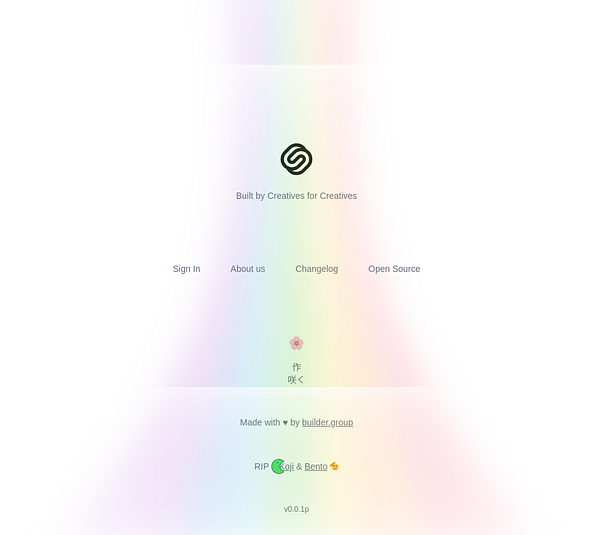
Ahh, got it - you mean the white border/shadow or whatever is causing that effect. May I ask what browser you’re using? I don’t see those artifacts in Chrome & Safari.
Yeah, 100% - my initial strategy once I have the product is to recreate people’s existing Link In Bios in Saku to show what’s possible. But definitely still figuring out a lot on the outreach side.. appreciate the suggestions :)
The landing page is fantastic. Great copy, great visuals. Very much inspired by the Linktree landing page in terms of theme, but with a bit more of a playful approach.
Small nitpick, the rainbow at the bottom of the page is warped a bit and it looks a bit off, maybe because of background effect of an element in front of it?
The challenge of your approach however - page before the product - means you probably will want to keep this audience warm for when launch happens. The reality is if you spend like a month+ building it now, many people will forget and say "wtf is Saku" when you send them that email telling them you launched. Some people might jump into your discord but definitely not everyone wants to do that.
Appreciate the kind words 🙌 Yeah, I intentionally distorted the rainbow to connect with the CTA box - do you think it would work better as a flower beam to tie in more with Saku (Japanese for "blooming")?
And totally - every approach has trade-offs. I went with a Landing Page first (Minimal Viable Representation, MVR) to validate the idea early and avoid building something nobody needs (which happened with most of my past projects).
Keeping the audience engaged until launch is definitely a challenge and something I don't have experience with - curious if you’ve seen any effective ways to do that beyond a Discord?
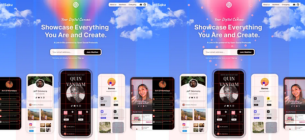
In terms of rainbow, I just meant what is in screenshot. Looks a bit warped at the bottom of the page.
For engagement, I think you only have email as opposed to discord. Depending on how many people you get, you could do some research on them and if there are any bigger name influencers or content creators, could reach out to them in person in a non-marketing email but just like "what would you like to see" kind of thing to open up communications. Don't know, this is obviously hard!
Ahh, got it - you mean the white border/shadow or whatever is causing that effect. May I ask what browser you’re using? I don’t see those artifacts in Chrome & Safari.
Yeah, 100% - my initial strategy once I have the product is to recreate people’s existing Link In Bios in Saku to show what’s possible. But definitely still figuring out a lot on the outreach side.. appreciate the suggestions :)
Kind of don't see the point of this. Just adds a further point of failure (in potential misinterpretation of instructions) and additional cost for literally no reason at all.
Using Puppeteer or something like it is maybe a bit more explicit, but would work much more efficiently.
Great project! As for landing page:
I get you are working with a language teacher on it, but might be helpful to say something like "based on a tried and tested curriculum developed by XYZ". This type of appeal to authority can help set you apart.
You also point out the insanity of some similar apps (ie. the whole "the dogs eat the apples" thing). But maybe go a bit further to explain how you're better. Maybe even a "TurkishFluent vs. Duolingo" and "TurkishFluent vs. Rosetta Stone" kind of pages linked in the footer could go a long way to explaining this stuff and also get you higher in search results.
Anyways, good luck! Again, great project.
The price was always bound to go up. In my opinion under-priced to incentivise people to use it. Both to increase adoption but also to provide more training data.
Future models will bring huge value, and costs should match ROI, but it’ll be a tough road, especially for consumers.
I occasionally listen to lofi.radio. Personally I'd perfer to use the browser instead of an app (I'm also on Linux so a mac app wouldn't work anyway).
Someone needs to bring Winamp back but integrate it with Youtube Music, Spotify and SoundCloud.