Good luck! I'm a Youtuber myself (and working on a YT project on the side) so going to be watching this one :)
oh sweet! I just took a look, very cool 👌. However, you are missing one of my favorite docs of all time :) "Life in a Day 2010 Film"
Congrats on the launch!
Messaging is pretty clear. However, I do think if you bother to have a CTA like "paste any yt link in here" right on the homepage, you gotta give them something beyond just a login. Maybe a basic summary with a "register to see full summary" or something like that. Right now, it seems a bit counter-productive.
Thank you Nikita 🙏. I do need to improve the “value upfront” aspect, I agree. I’m going to work on this! I appreciate you taking a look
Good luck! I'm a Youtuber myself (and working on a YT project on the side) so going to be watching this one :)
oh sweet! I just took a look, very cool 👌. However, you are missing one of my favorite docs of all time :) "Life in a Day 2010 Film"
I occasionally listen to lofi.radio. Personally I'd perfer to use the browser instead of an app (I'm also on Linux so a mac app wouldn't work anyway).
Someone needs to bring Winamp back but integrate it with Youtube Music, Spotify and SoundCloud.
thank you! as it turns out the import-cost extension is the culprit!
I would really try to expand the showcase of past work a bit. Right now you link to the project - it's fine, that speaks for itself. But: would be great to know how that process worked IRL for the client.
For example you could write out some of the details:
- What were the requirements for the project?
- How long did it take?
- If possible, a word from the client
- How you built it (maybe like tech used, etc)
Doesn't have to be all crammed onto homepage, but maybe there should be a page for each past project.
Good luck! Would be interesting to see if you get any customers via this.
Thanks for the feedback! Yeah, focus more on a case study rather than just showcasing.
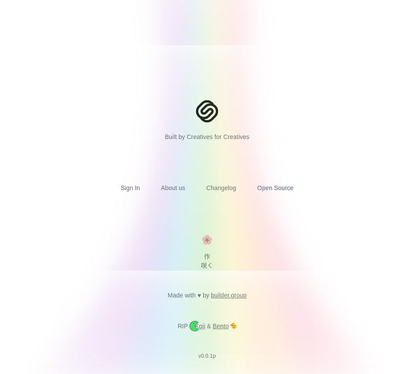
In terms of rainbow, I just meant what is in screenshot. Looks a bit warped at the bottom of the page.
For engagement, I think you only have email as opposed to discord. Depending on how many people you get, you could do some research on them and if there are any bigger name influencers or content creators, could reach out to them in person in a non-marketing email but just like "what would you like to see" kind of thing to open up communications. Don't know, this is obviously hard!
Ahh, got it - you mean the white border/shadow or whatever is causing that effect. May I ask what browser you’re using? I don’t see those artifacts in Chrome & Safari.
Yeah, 100% - my initial strategy once I have the product is to recreate people’s existing Link In Bios in Saku to show what’s possible. But definitely still figuring out a lot on the outreach side.. appreciate the suggestions :)
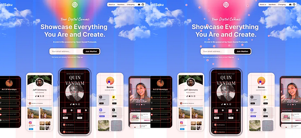
The landing page is fantastic. Great copy, great visuals. Very much inspired by the Linktree landing page in terms of theme, but with a bit more of a playful approach.
Small nitpick, the rainbow at the bottom of the page is warped a bit and it looks a bit off, maybe because of background effect of an element in front of it?
The challenge of your approach however - page before the product - means you probably will want to keep this audience warm for when launch happens. The reality is if you spend like a month+ building it now, many people will forget and say "wtf is Saku" when you send them that email telling them you launched. Some people might jump into your discord but definitely not everyone wants to do that.
Appreciate the kind words 🙌 Yeah, I intentionally distorted the rainbow to connect with the CTA box - do you think it would work better as a flower beam to tie in more with Saku (Japanese for "blooming")?
And totally - every approach has trade-offs. I went with a Landing Page first (Minimal Viable Representation, MVR) to validate the idea early and avoid building something nobody needs (which happened with most of my past projects).
Keeping the audience engaged until launch is definitely a challenge and something I don't have experience with - curious if you’ve seen any effective ways to do that beyond a Discord?
In terms of rainbow, I just meant what is in screenshot. Looks a bit warped at the bottom of the page.
For engagement, I think you only have email as opposed to discord. Depending on how many people you get, you could do some research on them and if there are any bigger name influencers or content creators, could reach out to them in person in a non-marketing email but just like "what would you like to see" kind of thing to open up communications. Don't know, this is obviously hard!
Ahh, got it - you mean the white border/shadow or whatever is causing that effect. May I ask what browser you’re using? I don’t see those artifacts in Chrome & Safari.
Yeah, 100% - my initial strategy once I have the product is to recreate people’s existing Link In Bios in Saku to show what’s possible. But definitely still figuring out a lot on the outreach side.. appreciate the suggestions :)


Ooooh good one thanks! I'll add it