Rafael F
@RafaelZolt
Hello Anna.
Congratulations on the landing page. I liked a lot the icon.
Some things to improve:
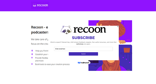
The popup looks weird over the text because it's the same color as the background. I suggest to not use a popup and just add the form directly to the page or at least change the color of the popup.
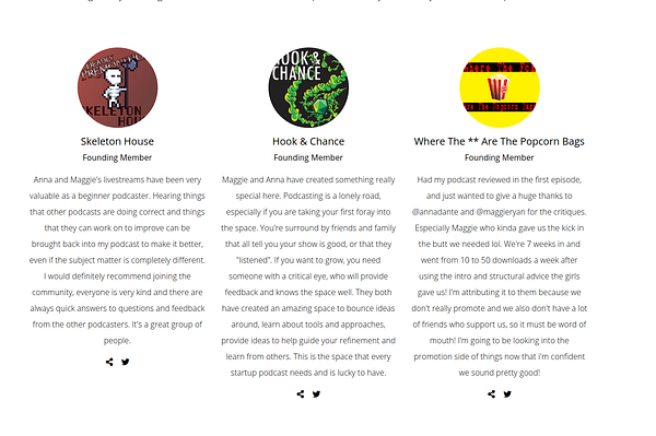
Increase the page max-width and add more space between columns on the section "What People Say" to look better on big screens. It's just a small detail not super important.
I couldn't understand what is the benefit of the subscription. When I read "easy workflows for podcasters" I thought it was a tool that does something automatically. Then from the text seems that you do manually set up for the client. And on this post you said it's a "paid community for podcasters"...
If it's a community: Why should a podcaster join your community?
I suggest instead of focus on what you do, try to explain the benefit the user gets: "Where is why you should join our community", and explain what problem it solves.
If you make the text more clear I am sure you will have a successful launch.


Hi Lucas.
1. I know it's still beta but the page still doesn't seem much trustworthy. Maybe adding some color and images will make it seem more legit.
2. Remove the link to the report or reduce the font size on the link. Otherwise visitors will go read the report and never come back to your page.
3. Rewrite the sentence in h2 "The 2020 ..." and instead write something about the benefit the visitor gets. Example "Scrapiste has hundreds of great Analytics jobs to help you find your next job quick." -> just an example I'm sure you can write something much better than this.
Hey Rafael, thanks for the great feedback ! Indeed, too much emphasis on the report will take users away and it could be more polished indeed. Taking the advice. I would be happy to return you the favor