Gabriel Chuan
@GabrielChuan
I try to rest my eyes for 5 minutes for every 25 minutes of work using pomodoro so yes(:
Hey Ibrahim! Thanks for replying! Attached is the rough idea of how I would like the sitemap to be. Would appreciate your thoughts on it! The "Why" / Goals of what I would like to achieve with the website are in red on the top left!
In addition, I meant to ask this question in the sense of: "are there any 'best practices'" for creating a website that is geared towards personal branding? Think Wes Bos, Coding Horror, etc
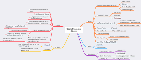
That looks like an excellent and well thought out start. I have two comments. 1. Maybe start with what the audience gets from the website. Learning or thought leadership are both good reasons for people to visit your site. 2. Build an audience and remember to add in a mailing list, and maybe even an email series using an autoresponder. I like Swizec site swizec.com/ - it is a good example of a personal website done well. Hope this helps.
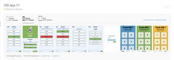
- The colours are really bad. It didn't give me any study vibes. Generally for study apps, you want a clean and crisp interface. It helps users to focus on the important content.
- What does the progress bar actually mean? What determines progress?
- No sound for pin yin pronunciations. This is very important for learning new languages
- Use absolute numbers instead of percentages for results. e.g. 7/10 correct. Percentages are not very educational or helpful.
Thanks! Very useful noted there.
You're right, I'm still looking for the right color scheme mood for the app. As Marc noted above, the font is kind of childish too. It's difficult to improve at the moment as I'm not a designer, but good to know that's an issue and will keep that in mind for future updates. The color scheme was originally more toned down, but it felt too clinical to me, I attached a screenshot below. What do you think?
It's the average of progress bars of all the words. The progress bars for words represent number of correct answers over the last 5 times you saw the word. That way, when you answer each war correctly 5 times in a row, your progress bar is completely filled up. It's a bit difficult to explain, so I didn't do that in the app. Any ideas how this can be improved?
Definitely worth doing. I'll need a good library of Chinese pronunciations, if anyone knows how I can get hold of these, do let me know! I know there's api.forvo.com/, I have it in my backlog to find out if I can store the downloaded recordings and serve them from within the app instead of calling their API each time.
Great idea, I'll implement that in the next update
Great thinking!!! I think we can quote this within the next 2 - 5 years when we have our first batch of Musks 😏
What are the features that you need? The answer is relatively dependent on that.
I want to be able to show the menu to user, let him select item+quantity, address, phone no, and any instructions for the order...
Personal preferences matters a lot. And I agree with Akshay. Pick whatever works best for you.
I’ve always loved Ruby’s syntax and found it very pleasant to work with — despite having friends who never really liked it.
As such, I would go with 2. Ruby on Rails.