Back
Post
Roast my third Landing - Focusing on Colivings❤️🔥👩🏼🚒
I'm changing the design of the previous landing as it wasn't talking that much about the colivings.
This is the link of the current one here.
This is the figma of the new one (the phone is an animation with different screenshots of the features):
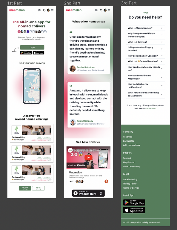 Screenshot 2023-03-14 at 17.15.57.png
997 KB
Screenshot 2023-03-14 at 17.15.57.png
997 KB
This is the link of the current one here.
This is the figma of the new one (the phone is an animation with different screenshots of the features):
Screenshot 2023-03-14 at 17.15.57.png
997 KB
👋 Join WIP to participate
The overall construction of the landing page is nice and I like it. However, core elements such as the color scheme is, to say it delicately, unusual in a not-so-positive way. While each color alone would work okay, when put together, they look very unappealing to my eyes. I cannot find any relation to the "subject".
Thank you for the feedback! I didn't like the colors either😅
They are supposed to be the colors of a watermelon(because of the name) I will see what I can do with them.
@screenfluent made a good point; the color scheme is not perfect. I think the gradient on the title doesn't work because the colors don't match in the middle creating an ugly green.
One thing I would add is more spacing vertically between the elements. Appart from that, it seems pretty solid, I understand the product and that is key
Totally true with the gradient, I think I will just go with black until we decide to change the colors.
I always have to add more space haha, will do, thanks!