Thanks for your feedback 🙂
What are your thoughts on this version:
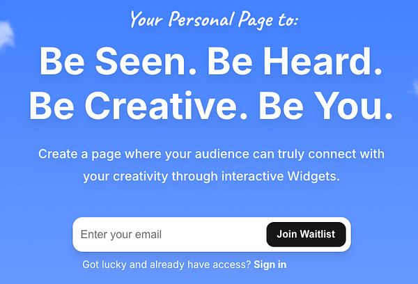
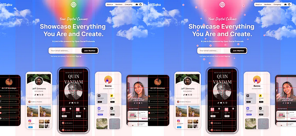
Your Personal Page to:
Be Seen. Be Heard.
Be Creative. Be You.
Create a page where your audience can truly connect with your creativity through interactive Widgets.
I'm also no marketer by any means - figuring things out as I go. Really appreciate your input 🚀
Thanks for sharing :) Looks amazing 🚀
Definitely helps validate the core idea a bit. Seems like there are now around 5-10 "Bento/Widget"-style link-in-bios, and this one is the latest addition.
Yeah, the plan is to grow organically and through word of mouth by building something genuinely useful with a wow factor.
Thanks for the feedback :)
You mean like this? Or am I missing something? 🚀
yeah for example. though right now first line is a lot longer so a bit unbalanced maybe?
depends also how tied you are to the current H1
maybe the "and Create" part is a bit vague / not really fitting.
I'm saying all of this as a person who just skimmed it without looking deeper into it (like most website visitors would do i think)
I never used any kind of these tools, so the tagline was also a bit confusing for me (i.e. I didn't know what the product was for judging from the tagline alone)
I'll give my humble vote to just "Showcase Everything You Create" – for me is shorter and more clear. The "You are" part reads a bit forced and vague.
The sub-headline could also be shorter, f.ex. "a place where your audience can connect with you through interactive widgets"
Disclaimer: I am not a marketer!
Other than that, the landing page looks good to me! Good luck!
Thanks for your feedback 🙂
What are your thoughts on this version:
Your Personal Page to:
Be Seen. Be Heard.
Be Creative. Be You.
Create a page where your audience can truly connect with your creativity through interactive Widgets.
I'm also no marketer by any means - figuring things out as I go. Really appreciate your input 🚀
You mean the header isn’t formatted correctly on your device? Does it look like the attached image?
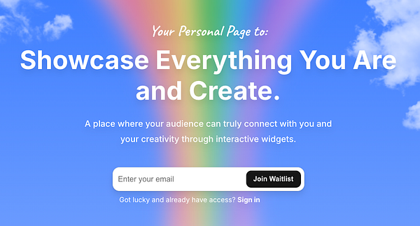
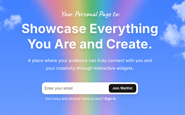
Saku is about showcasing everything you are and create - whether it’s your work, adventures, or anything else that represents you. Maybe the wording isn’t super clear - appreciate the feedback!
If you're curious about the bigger vision, you can check out the Manifesto at saku.so/manifesto 🚀
I had the same. It reads a bit weirdly right now with the second line being
"You Are and Create"
Better would be,
"Showcase everything you are"
"and Create"
separate lines.
Maybe there's an even better way to do it but right now i was confused as well.
otherwise site looks absolutely beautiful
Thanks for the feedback :)
You mean like this? Or am I missing something? 🚀
yeah for example. though right now first line is a lot longer so a bit unbalanced maybe?
depends also how tied you are to the current H1
maybe the "and Create" part is a bit vague / not really fitting.
I'm saying all of this as a person who just skimmed it without looking deeper into it (like most website visitors would do i think)
I never used any kind of these tools, so the tagline was also a bit confusing for me (i.e. I didn't know what the product was for judging from the tagline alone)
I'll give my humble vote to just "Showcase Everything You Create" – for me is shorter and more clear. The "You are" part reads a bit forced and vague.
The sub-headline could also be shorter, f.ex. "a place where your audience can connect with you through interactive widgets"
Disclaimer: I am not a marketer!
Other than that, the landing page looks good to me! Good luck!
Thanks for your feedback 🙂
What are your thoughts on this version:
Your Personal Page to:
Be Seen. Be Heard.
Be Creative. Be You.
Create a page where your audience can truly connect with your creativity through interactive Widgets.
I'm also no marketer by any means - figuring things out as I go. Really appreciate your input 🚀
Ahh, got it - you mean the white border/shadow or whatever is causing that effect. May I ask what browser you’re using? I don’t see those artifacts in Chrome & Safari.
Yeah, 100% - my initial strategy once I have the product is to recreate people’s existing Link In Bios in Saku to show what’s possible. But definitely still figuring out a lot on the outreach side.. appreciate the suggestions :)
Thanks for the insight! Definitely still a lot to figure out.
I just noticed you're an actual user of a Link In Bio tool - you went with bio.link. Curious, what made you choose it over the other options? Was it the domain, simplicity, or something else?
Also, just for fun, I threw together a quick concept of how your bio.link page could look in Saku using Widgets - would love to hear your thoughts! 🚀
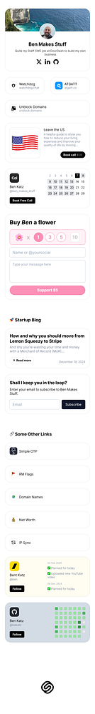
Wow, thanks for the extra effort there. That does look quite a bit better than what I have now.
I mainly went with biolink because it was free and I just wanted to quickly add some links I wanted people to visit.
I think I'm starting to see the value prop of what you're offering now. Much better design with custom components + CTAs that will lead to better conversion etc
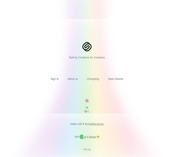
Appreciate the kind words 🙌 Yeah, I intentionally distorted the rainbow to connect with the CTA box - do you think it would work better as a flower beam to tie in more with Saku (Japanese for "blooming")?
And totally - every approach has trade-offs. I went with a Landing Page first (Minimal Viable Representation, MVR) to validate the idea early and avoid building something nobody needs (which happened with most of my past projects).
Keeping the audience engaged until launch is definitely a challenge and something I don't have experience with - curious if you’ve seen any effective ways to do that beyond a Discord?
In terms of rainbow, I just meant what is in screenshot. Looks a bit warped at the bottom of the page.
For engagement, I think you only have email as opposed to discord. Depending on how many people you get, you could do some research on them and if there are any bigger name influencers or content creators, could reach out to them in person in a non-marketing email but just like "what would you like to see" kind of thing to open up communications. Don't know, this is obviously hard!
Ahh, got it - you mean the white border/shadow or whatever is causing that effect. May I ask what browser you’re using? I don’t see those artifacts in Chrome & Safari.
Yeah, 100% - my initial strategy once I have the product is to recreate people’s existing Link In Bios in Saku to show what’s possible. But definitely still figuring out a lot on the outreach side.. appreciate the suggestions :)
Yeah, definitely not trying to solve for everyone at the start. The idea is to build the foundation first and then add widgets based on what people actually need - since everything can be a widget, it keeps things flexible. The core value is making it feel familiar, like customizing your iPhone home screen, but outward-facing.
100% agree on niching down. That’s why I’m starting with Bluesky creators, designers, and developers, leaning into the open-source and open-sky theme to resonate with that audience.
As for the domain, yeah, I have sub.me, but it doesn’t quite fit for a link-in-bio. Later, though, if people use Saku to build Patreon-like setups with widgets, it might make more sense.
Appreciate the insight - it’s clear that focusing on a niche first is the way to go before expanding 🚀
And yeah, I definitely need to validate the idea, which is exactly why I started with the landing page 🙂
Curious about your take on Bento.me - they managed to break through despite not having a premium domain or more features. Do you think their success came from the Bento grid layout (which is quite similar to the widget approach), or was it something else that made them stand out?
Note: Koji & Bento are a huge inspiration - honestly, I wouldn’t have even considered building Saku if Linktree hadn’t shut both of them down. Waited one year but it seems like LinkTree acquired them to get rid of competition.
No idea, haven't heard of them. Main point is you should try to differentiate somehow.
I don't know if a grid is the best way to do that (genuinely don't know, maybe people give a shit about that - I don't but N=1)
Thanks for the insight! Definitely still a lot to figure out.
I just noticed you're an actual user of a Link In Bio tool - you went with bio.link. Curious, what made you choose it over the other options? Was it the domain, simplicity, or something else?
Also, just for fun, I threw together a quick concept of how your bio.link page could look in Saku using Widgets - would love to hear your thoughts! 🚀
Wow, thanks for the extra effort there. That does look quite a bit better than what I have now.
I mainly went with biolink because it was free and I just wanted to quickly add some links I wanted people to visit.
I think I'm starting to see the value prop of what you're offering now. Much better design with custom components + CTAs that will lead to better conversion etc
Love it, thanks for sharing! 🙂
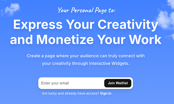
My current heading is:
Your Personal Page to:
Express and Monetize Your Creativity.
A Link in Bio that turns your creativity into an interactive experience through Widgets.
I feel like this is an improvement over "Showcase Everything You Are and Create", but still has a long way to go for sure.
Am I on the right track?