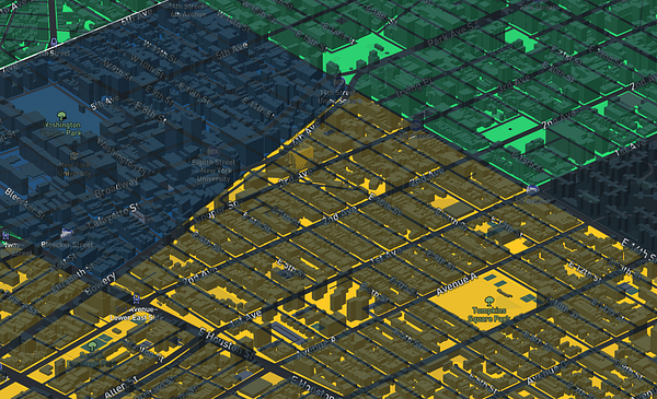
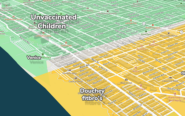
How do you mean normie tags? You mean the tags in general?
No sorry I phrased this a bit clumsy. I meant the normie paint the low contrast between the normie paint blocks and the street contours can, especially in the city centers, make it hard to orientate oneself and sometimes can be a bit confusing so I have to zoom out a bit to figure out where I am on the map.
Ah right, I've made the normie paint color the same as the general map background color, because most areas outside the city (which are non-normie) are normie anyway. I'll try make it a bit brighter
I finally figured out what I meant, it's that the building blocks are a separate dark color which disorientates me (since it has the same appearance as a street), I would love for them to just be a darker shade of their background color (maybe make them black with a 0.3 or so opacity e.g. rgba(0,0,0,0.3)), hope it helps!
Edit: not sure this is it, I've still got it somehow when zooming out but not when I switch to districts
Ah yes, same! But impossible with Mapbox's 3d building layer. I can only style the buildings based on data inside that 3d buildings layer (like height). But the color of the neighboorhood is a different GeoJSON layer unfortunately. Only way would be to make my own 3d buildings layer and color each building, but getting 3d buildings for the whole world would be too much work.
I can definitely make the buildings transparent though! Will try that now, thanks
Hoodmaps is so awesome and I use it a lot, I slightly panicked when I thought you removed the option to view raw data (thanks for keeping it there). I use HM every time I book an apartment in a new city and it has been invaluable in making sure I can have access to an expensive avocado toast in every possible direction
- The Districts toggle is quite nice but I would find it more intuitive to click a button with the label "raw data" to view the raw data instead of a toggle button that displays the current state.
- The raw data view can feel a bit overwhelming and unclear, not completely sure why but I think because the normie tags are hard to differentiate from the streets/street outlines.
- It asks for location access every time I visit the site, also when I'm directly visiting a city by URL.
Thanks for making this, it's super useful and fun!
It asks for location access every time I visit the site, also when I'm directly visiting a city by URL.
Thanks! Fixed this now, it will ONLY ask for geolocation permission if you tap the GPS icon in bottom right, this will center the map on your location. And it'll forward the frontpage to your nearest city based on GeoIP instead.
The Districts toggle is quite nice but I would find it more intuitive to click a button with the label "raw data" to view the raw data instead of a toggle button that displays the current state.
Nice, I had just changed that because @marckohlbrugge said the opposite haha. I'll ask Twitter what the most popular way would be.
The raw data view can feel a bit overwhelming and unclear, not completely sure why but I think because the normie tags are hard to differentiate from the streets/street outlines.
How do you mean normie tags? You mean the tags in general?
How do you mean normie tags? You mean the tags in general?
No sorry I phrased this a bit clumsy. I meant the normie paint the low contrast between the normie paint blocks and the street contours can, especially in the city centers, make it hard to orientate oneself and sometimes can be a bit confusing so I have to zoom out a bit to figure out where I am on the map.
Ah right, I've made the normie paint color the same as the general map background color, because most areas outside the city (which are non-normie) are normie anyway. I'll try make it a bit brighter
I finally figured out what I meant, it's that the building blocks are a separate dark color which disorientates me (since it has the same appearance as a street), I would love for them to just be a darker shade of their background color (maybe make them black with a 0.3 or so opacity e.g. rgba(0,0,0,0.3)), hope it helps!
Edit: not sure this is it, I've still got it somehow when zooming out but not when I switch to districts
Ah yes, same! But impossible with Mapbox's 3d building layer. I can only style the buildings based on data inside that 3d buildings layer (like height). But the color of the neighboorhood is a different GeoJSON layer unfortunately. Only way would be to make my own 3d buildings layer and color each building, but getting 3d buildings for the whole world would be too much work.
I can definitely make the buildings transparent though! Will try that now, thanks
For earbuds definitely the Anker Soundbuds Slim, whatever the newest version is. And I got the Sony WH-1000mk3, it's pretty nice. The soundbuds sound great, fit great and are cheap enough to lose. If I could only own one ever I'd pick the soundbuds but they are really nice together as a duo.
True, downloading is only possible on really good wifi connections, super super weird
I have a very fast connection tho 😂
No worries because I settled on Castbox :)
Google podcasts
I read the reviews & every single one was worse 😂
Edit: I tried it but it can't download the podcast episode
True, downloading is only possible on really good wifi connections, super super weird
I have a very fast connection tho 😂
No worries because I settled on Castbox :)


I finally figured out what I meant, it's that the building blocks are a separate dark color which disorientates me (since it has the same appearance as a street), I would love for them to just be a darker shade of their background color (maybe make them black with a 0.3 or so opacity e.g. rgba(0,0,0,0.3)), hope it helps!
Edit: not sure this is it, I've still got it somehow when zooming out but not when I switch to districts
Ah yes, same! But impossible with Mapbox's 3d building layer. I can only style the buildings based on data inside that 3d buildings layer (like height). But the color of the neighboorhood is a different GeoJSON layer unfortunately. Only way would be to make my own 3d buildings layer and color each building, but getting 3d buildings for the whole world would be too much work.
I can definitely make the buildings transparent though! Will try that now, thanks
Tried now with 0.5 opacity, nice, also not nice. Gets messy quickly
Switched the theme to light now and it seems to work now! Thanks :D