Back
Post
Roast my quote layout
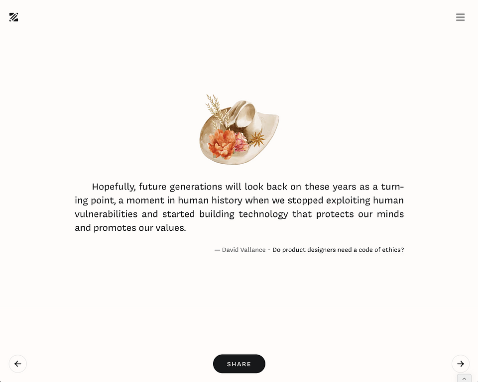
Just a few days ago I launched Zenpen.club. Would be happy to see especially what you think of the layouts where I list the quotes, one by one.
 Screenshot 2024-11-05 at 10.44.54.png
388 KB
 Screenshot 2024-11-05 at 10.44.54.png
388 KB
👋 Join WIP to participate
"Do not use quote UI from a guy who cant write Roast" - Albus Einstein
Why is the image so small on otherwise empty page is weird to me.
Sorry, my auto-correct beat me. 🫣
I picked this exact image size to balance with the size of the font. Also, if the image is too big, it will push down the text, which would be especially visible for longer quotes. And then, I also want to ensure it doesn‘t look oversized on mobile. Performance-wise, I wanted to ensure each image doesn‘t weight more than 20kb, to ensure ultra-fast load because people paginate through many quotes at a session (according to my site analytics.)
That exact quote in action:
zenpen.club/quote/future-generations-for-humane-technology
Fair enough.
You should be able to use keyboard and touch events to navigate through. Another words, on mobile you should be able to swipe forward or back. On desktop, you should be able to use your keyboard keys to go navigate the quotes.
Other than that, the design appears clean and readable to me.
However, I think you could massage it a little bit. First, the quote doesn't feel very "quotey" (made up word just now). You could play with the font weight to produce more emphasis on the quote. After all, it's meant to be the primary focus of this page, right? Don't be afraid to make it heavier and stand out more.
Also the images are a bit strange, agree with @baldai. I think it could be worth it to use line drawn illustrations instead. That way, again, the focus goes back to the quotation itself.
Hope this helps!
You nailed it, @fiiva. All those suggestions are actually on my roadmap. 😊 It‘s just I lack advanced dev skills, and I‘m waiting on outside dev help.
I would even go further to make the font size dynamic depending on the quote lengths. This current font size is picked as average.
As for the images… it‘s just something to put a cherry on top. I might update them in future, to pick something more relevant, or a different style as you suggest. For now, I focus on building content and making it SEO friendly because finding 1000+ consistent illustrations is too time-consuming at this stage. But I plan to pay more attention in the future; perhaps even help illustrators get featured somehow.
Best of luck!